

Double Rainbow Plans Acrylic and ink on canvas, 46" x 46", 2013
This is a different sort of blog post for me. I've never really been interested in talking about "process" where it concerns my own artwork, mostly because I'm just a painter, and there's no real mystery to what I do. I'm not interacting with mold cultures or programming micro-controllers in the name of art. There's nothing "performative" or interactive about what I do. I sit in front of an easel and slowly render things.
But like most folks, I'm fascinated with the details of other artist's creative practices. There are some artists I'd love to hang out with and watch while they work. It would probably be pretty boring, not to mention totally creepy and distracting for the artist, but I would jump at the chance to see how they get from A to B. In the big picture, an artist's sources of inspiration, his or her work-flow habits, whether or not they're a drinker, and who they sleep with aren't supposed to matter. Art is supposed to be able to "stand on its own" without leaning on a bunch of stories. But I can't help suspect that art never, ever does stand on its own. Not entirely. Social context and the artist's personal history always inform the work. It's one thing to know Mark Rothko intended his paintings to be "spiritual," it's another to know he was a depressed suicidal alcoholic who sought transcendence through his creative practice. Each painting he completed was a milestone on a desperate journey of self-redemption. We might look back now and decide he was tragic, but at the height of his fame, Rothko painted like his life depended on it - like each painting would keep him in the world a little longer.
These sorts of stories aren't just told to keep kids awake in art survey classes. They help give us access to an artist's psyche, and to place them in a meaningful historic context. It is impossible to know these tales and not be influenced by them. We are, after all, story-telling creatures.
So without further delay, I've decided to lift the lid on my own process. Not because I think there is anything novel about it, but because its ordinariness allows uncomplicated access to the ideas behind the work.
 | |
| Double Rainbow |
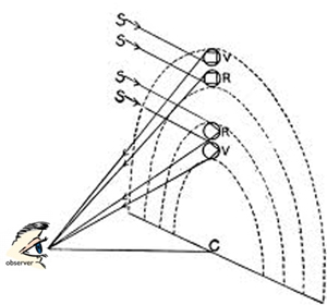
Recently, I ran across this double rainbow diagram while perusing images in an old science textbook. I am drawn to these kinds of diagrams because they are attempts to describe complex principles in highly abstract manner meant for ease of instruction. But I also like them for their metaphorical potential when the viewing context is deliberately shifted. I kept returning to this image from time to time to see if I could build a painting around it. Rather than looking like a description of how double rainbows actually work, it began to look like a plan for how to make one, if such a thing were possible. The title Double Rainbow Plans popped into my mind, and almost immediately I wondered what sort of person would be making plans for a double rainbow. A child, probably. Someone beginning to imagine the life ahead. Someone maybe on the doorstep of puberty. Someone with a lot of belief, and more than a little uncertainty.
Around this same time I began exploring the idea of doing "double-portraits." These show two views of the same person interacting with him/herself. It was a rather literal way of picturing the self split along the lines of belief/doubt, action/inaction, confidence/fear, and so on. I began looking at my friend's children as possible models. Preferably the parents would be creative types, so there wouldn't need to be a whole lot of cajoling and explaining. When you're asking to photograph someone's children, there's a whole Pandora's box of concerns that could spring open. Fore sure it needed to be done by a professional photographer in a real studio, not in my basement studio; and with a parent present and involved. It was going to cost money.
Pretty quickly I thought of an artist friend I have, Jennifer Jeannelle, and remembered that her kids were not only the right age, and the right sort of "look" I was going for, but having an artist for a mom, they were used to being roped into wacky creative endeavors. I had even seen them doing performance art. I didn't know Jennifer that well, so when I reached out to her it was with great faith that this would make sense to her. I described the double rainbow and the double portrait over the phone without showing her anything. Immediately she began offering great suggestions on wardrobe. She also sold the idea to her kids, Sophie and Eric, so I knew this was going to work. The photographer Anthony Camera was available to do the shoot, and the kids had the following week off for spring break. Perfect.
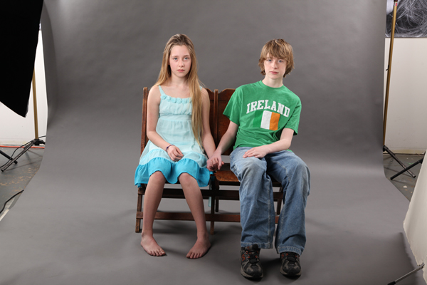

For the main image, I wanted Sophie to be holding hands with herself. This would involve some Photoshopping, but with Eric's "stand-in" hand to hold, I knew I could get what I wanted. What I hadn't counted on was the sibling's lack of enthusiasm for holding hands with each other. After some coaxing, they settled into their roles, with instructions to keep their hands in exactly the same spot so each of the shots would more or less line up when they switched chairs. The images above show Eric leaning comically away from his sister. Though he wasn't thrilled about holding her hand, he is leaning because we needed him to keep his shadow off of her.
Sophie was directed to have two distinct attitudes in the shot. On the left, she stares straight ahead into the camera, with a look of confidence and the tiniest hint of a smile. This version of herself was to be capable and in-charge. Her other "self" was to lean slightly away, with a look of uncertainty. Both kids took this assignment seriously and gave me exactly what I was looking for, with almost no effort.

After staring at these shots for a couple of days, I decided I liked the effect of the gray sweep we shot the kids against. I had intended to replace it with something else, but the gray began to grow on me. It just needed some sort of graphic element in the background to activate the space. I also decided that I didn't like the theater seats in the shot and began looking on Google for something more dramatic. I found a French settee that was shot at a workable angle and had an interesting look. By changing the color from burnt orange to lime green it achieved a pleasant ridiculousness that contrasted nicely with the seriousness of French furniture. The scroll fragments in the background were "stock" illustrations left over from a graphic design job that I licensed them for, but never used. They went well with the settee, and helped frame the central figures in a way I liked.

At this point I should say that most artists pursue a certain "look" that strikes the right balance between what is expected of them, and what allows for a satisfying deviation from that same expectation. Call it a "style," or if that's too crass, think of it as artistic parameters. Either way, an artist often does a given thing simply because it is the kind of thing they've decided they do. This is part of what gives a body of work coherence. I chose the graphic scrolls in the background because I've been using flat graphics like that for quite some time, and because lately I've shifted toward combining imagery that is contradictory in terms of historical period, allowing me no fixed reference point in time.
After a week of planning, shooting and Photoshopping, it was finally time to make a painting. Along the way I'd decided that this painting needed real presence. I wanted to make it life-size, but it would have been about 6' square. I settled on 46" square, which corresponds to the largest size I can fit in my car.
.JPG)
I've always been up-front about my use of a video projector to rough-in the outlines of my imagery on a blank canvas. I want the proportions to be right, especially with the human figure, and I simply don't have the time, skill, or interest to render everything freehand. I adore the people who can do that, but I'm not one of them. That said, I only trace the outside shape of things. There's simply no point in getting too granular with the tracing lines, because as soon as you begin applying paint you cover them up. One way or another, a painter has to know how to render something using paint. Hence, all the photos taped to my canvas for reference.
Usually, when I get near the completion of a painting I find need to put it away for a few days and go do something else, because by then it has completely taken over my brain and I can't even see it anymore. The hope is that when I return to it again I might actually be able to apprehend it with some degree of clarity. It's usually then when some detail pops out at me and I realized I've gotten a shadow wrong or made a leg too big. After a few rounds like this the work settles into its final form. If all goes well the work may begin to make me smile. Sometimes I really dig it and rush it onto Facebook. Days later I may decide it's not done.
Sometimes I can labor over a painting for weeks without knowing whether it's any good. When it isn't, I have no trouble marching it out to the garage. I've got literally dozens of canvases languishing out there, waiting to be reborn as entirely different paintings. But when it is good, and you move it out to your gallery, it's surprising how big a hole it can leave in your psyche. I'm usually lost for a few days when a painting I love leaves the studio. It stands to reason, given the dozens (sometimes hundreds) of hours I've spent conjuring the thing into being. I miss the people in my paintings. Sometimes I just miss the presence of the thing. Still it takes me by surprise when it's gone, and the only workable remedy is to get started on another one.
Thank you Mark for making my children feel special and important throughout this whole process. What a unique way of documenting their youth and innocence. Love it, love you!
ReplyDeleteThis was just so interesting, a total pleasure to read. I liked the painting when I saw it on FB, but even more now.
ReplyDeletethanks, Heather!
DeleteYour writing, like your art flows; it's quietly convincing and quite limber... engaging, really. You are a thoughtful and talented man, Mr. Mark.
ReplyDeleteWow. Thanks, Mark!
Delete